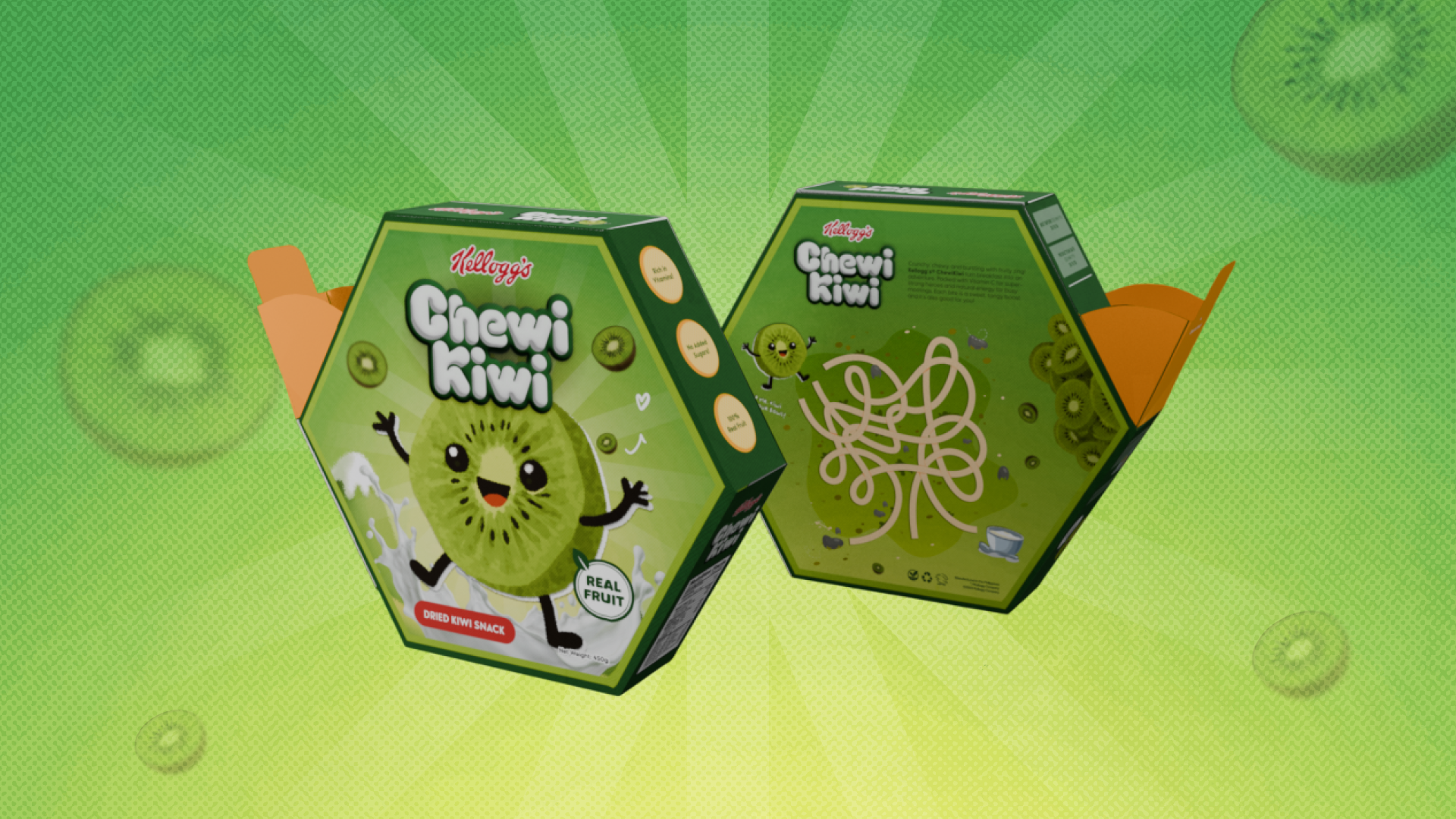
The Direction
The goal was to design a unique non-traditional box structure and build a full visual system around it — from the dieline, to packaging, to the marketing poster, to the final physical output.
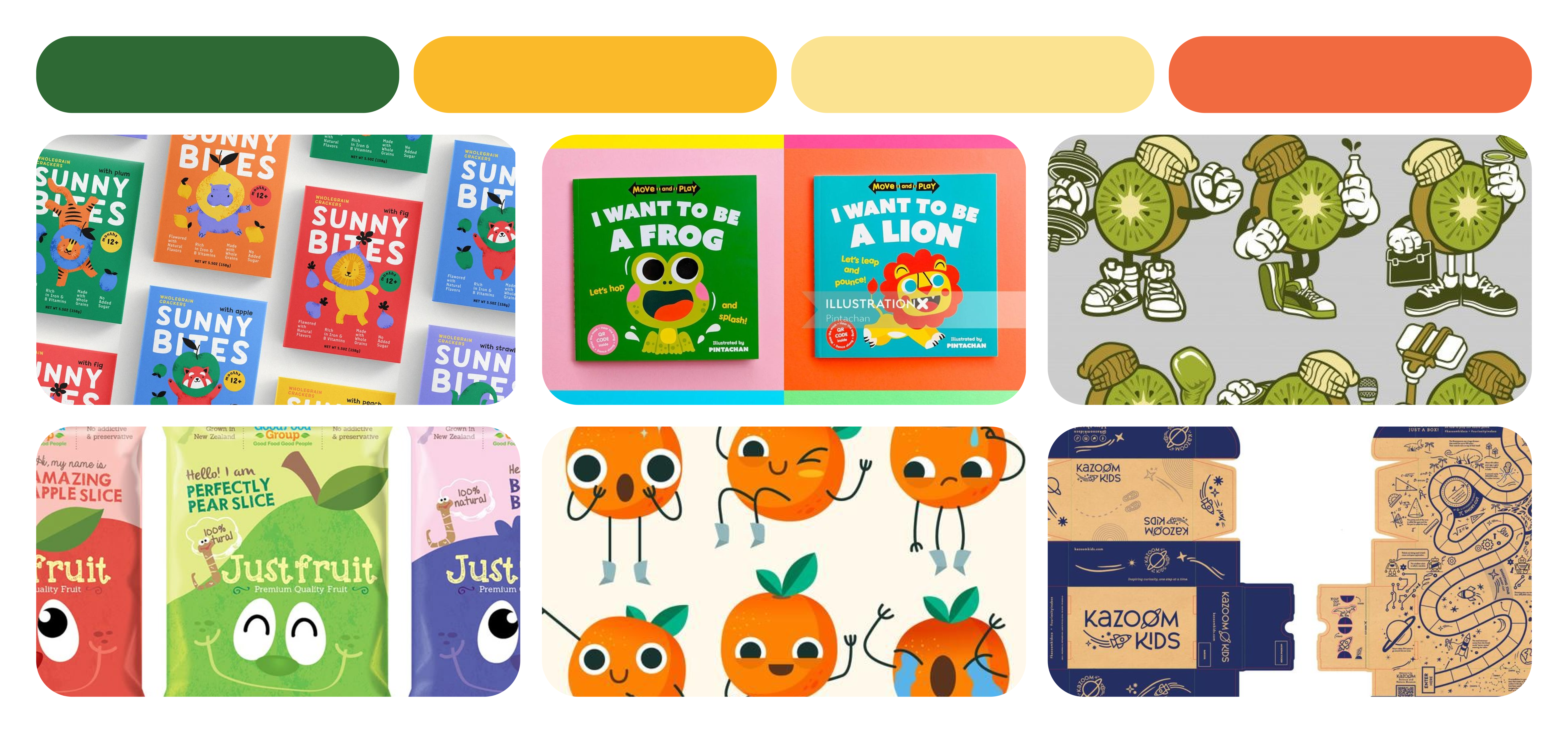
Packaging Structure Exploration
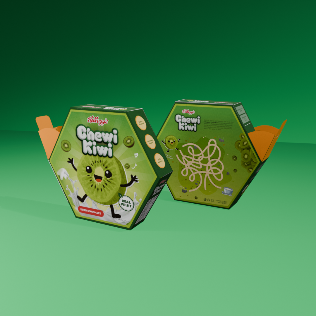
This was the hardest part. Instead of using a traditional box, we pushed for a diagonal, non-rectangular structure.
The process included printing multiple mini-prototypes, testing alignment and folding, and adjusting the dieline until it was structurally sound and graphics wrapped cleanly.
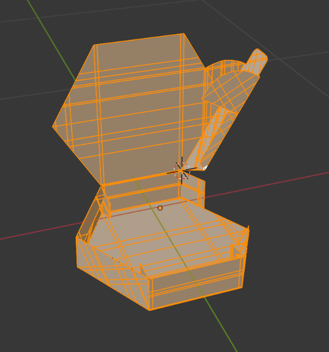
Packaging Design
Once the structure was stable, I built the visual layout around a playful front composition, semi-realistic fruit elements, energetic splash accents, a new mascot pose, and typography that matched the brand’s personality.
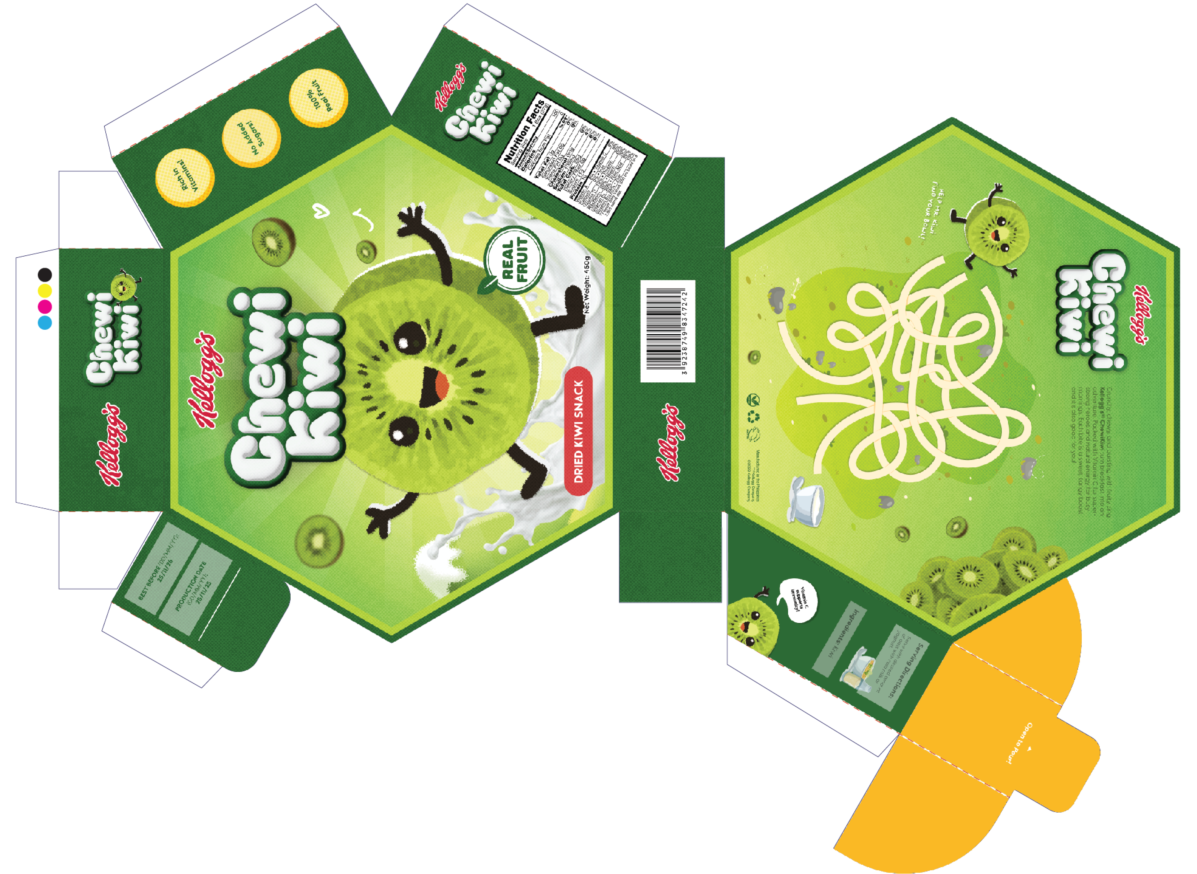
Marketing Poster
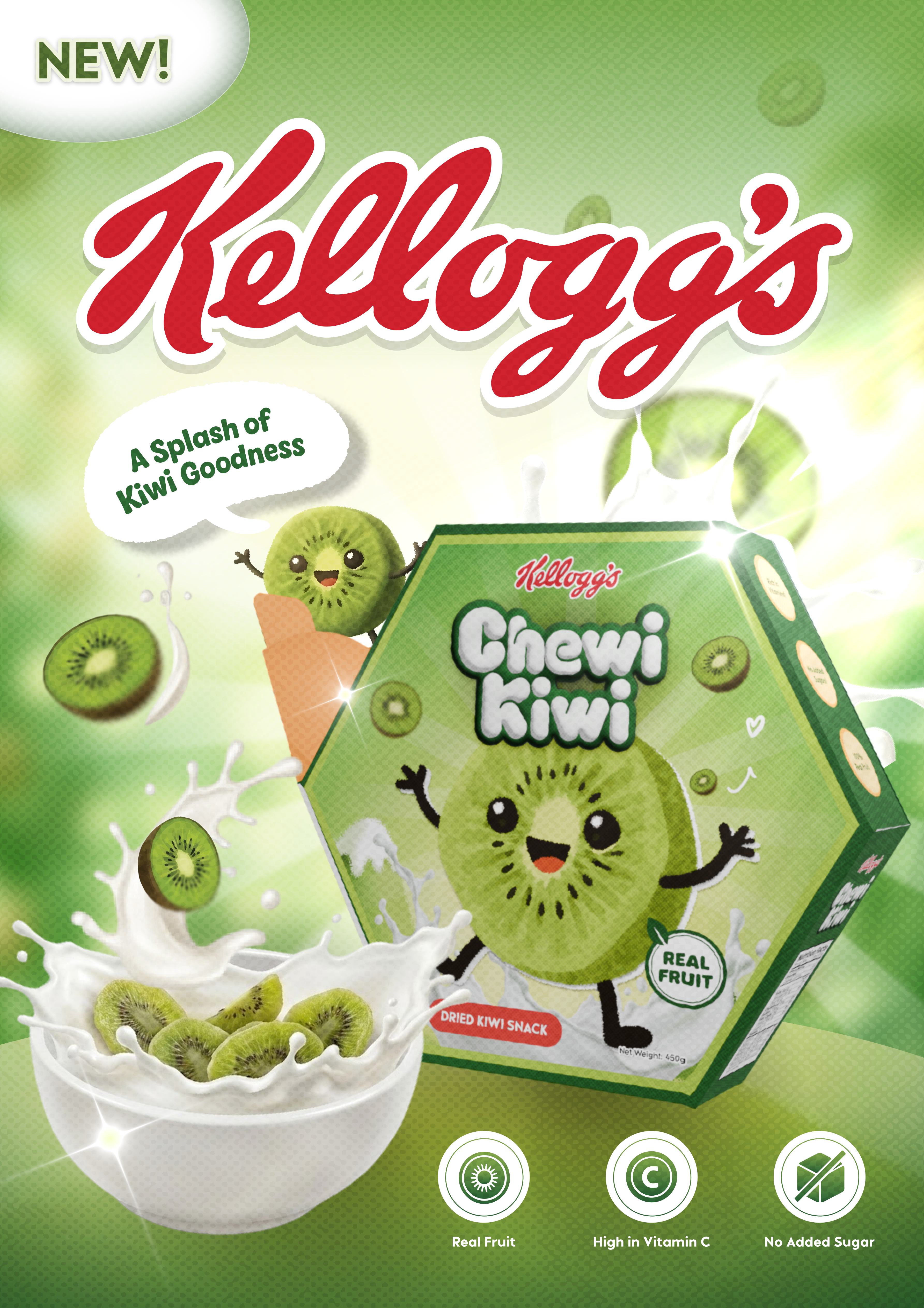
To extend the brand, I created an A3 poster featuring falling kiwi slices, dynamic energy, a mix of realism and graphic elements, and a strong diagonal hierarchy.
Final Output
The final physical output brought the entire vision together, combining the experimental structure with the vibrant visual system.
Note: This is a personal concept project created for exploration and skill development. Not affiliated with or designed for Kellogg’s.
 LinkedIn