The Challenge
Idang’s Tostado is a beloved handmade delicacy from Santander, Cebu. However, the original packaging lacked a clear visual identity and failed to protect the product during transport.
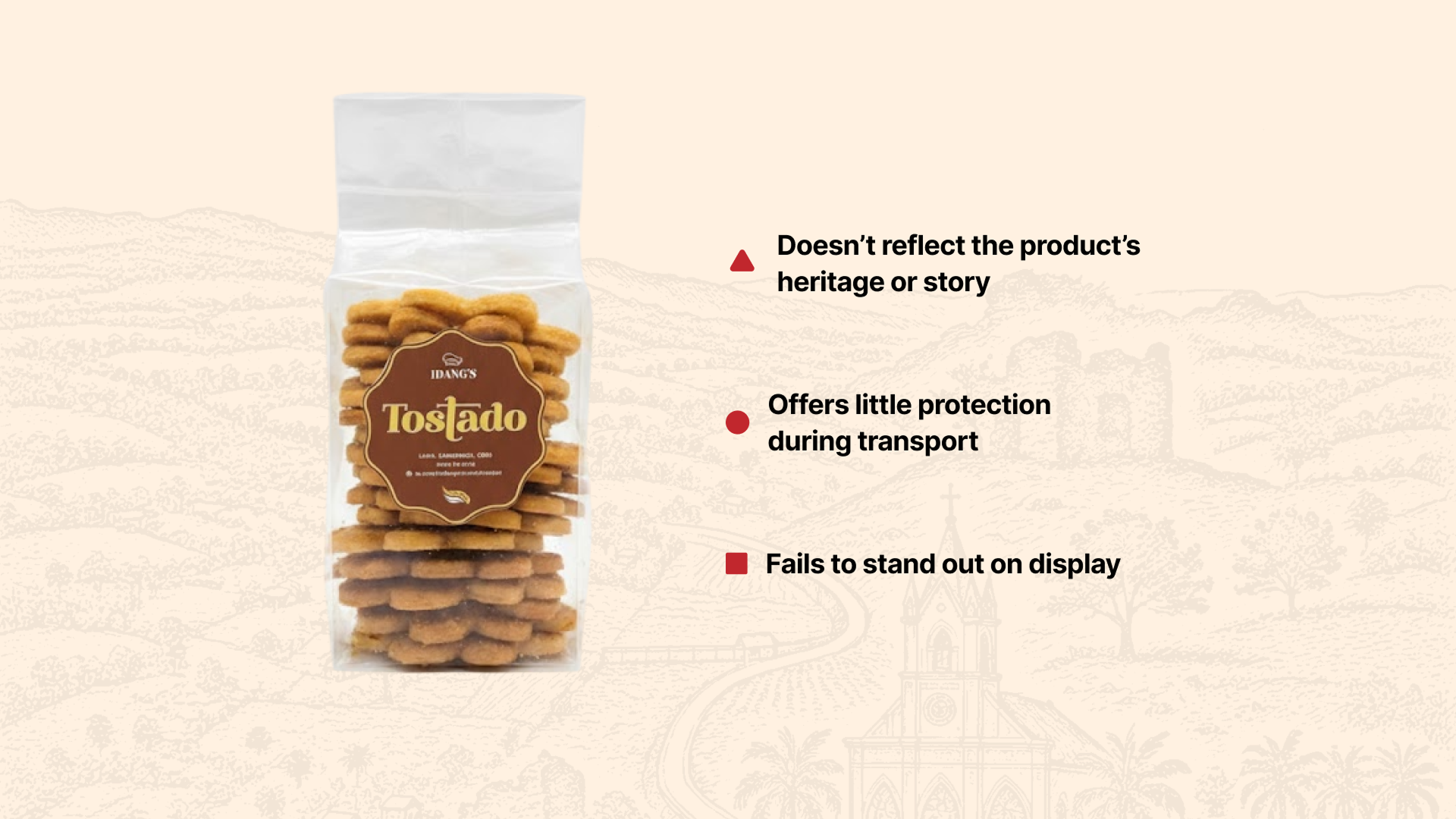
The original packaging lacked cohesive branding and structural durability.
The Direction
We established a visual system that celebrates its Santander roots through warm tones and clean typography, transforming it into a premium pasalubong.
Celebrating Santander roots and handmade tradition.
Earthy tones reflecting toasted sugar and craftsmanship.
Clean typography inspired by classic bakery labels.
Designed to be shared as a memorable Cebuano gift.
The Process
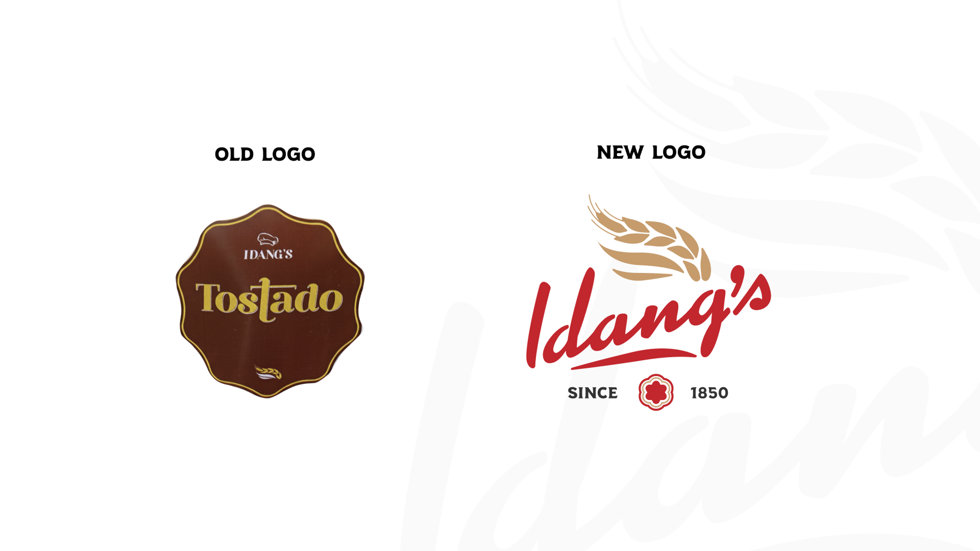
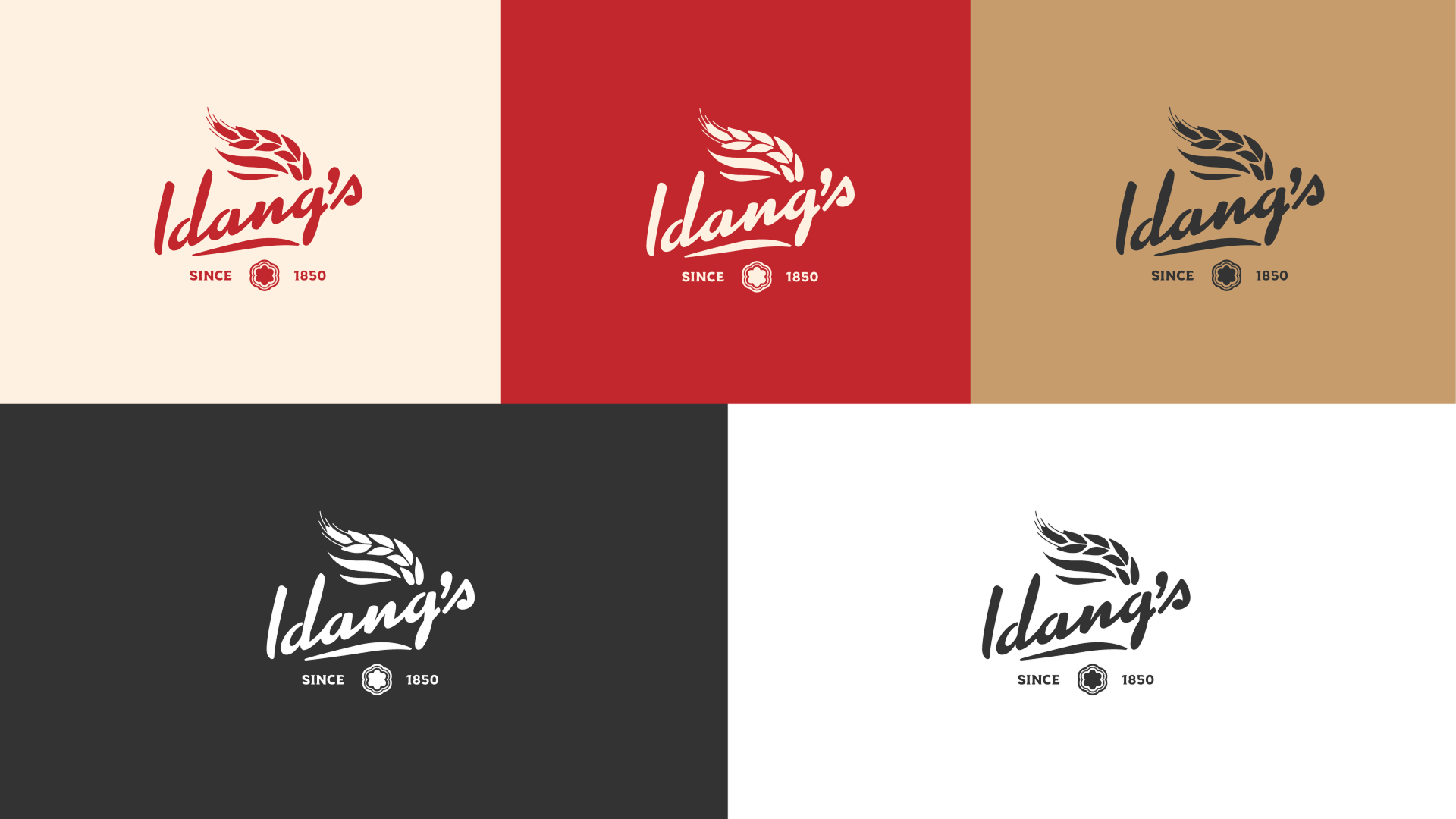
The redesign focused on balancing tradition with clarity and modern presentation. The logo system was refined to create a stronger visual identity while still feeling familiar and local.
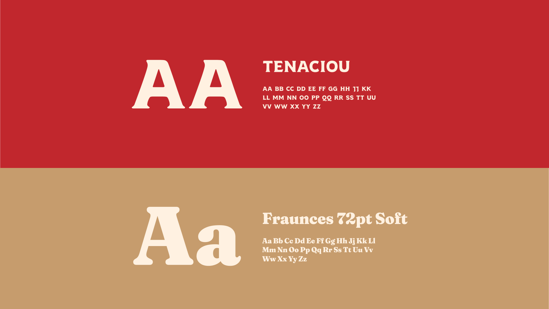
Typography choices were inspired by classic Filipino packaging and traditional bakery labels, giving the brand a nostalgic but clean appearance. The color palette uses warm earthy tones to reflect toasted sugar and local craftsmanship.
Supporting patterns were developed from shapes and textures inspired by woven materials and local visual motifs to reinforce the product’s heritage.
The Redesign
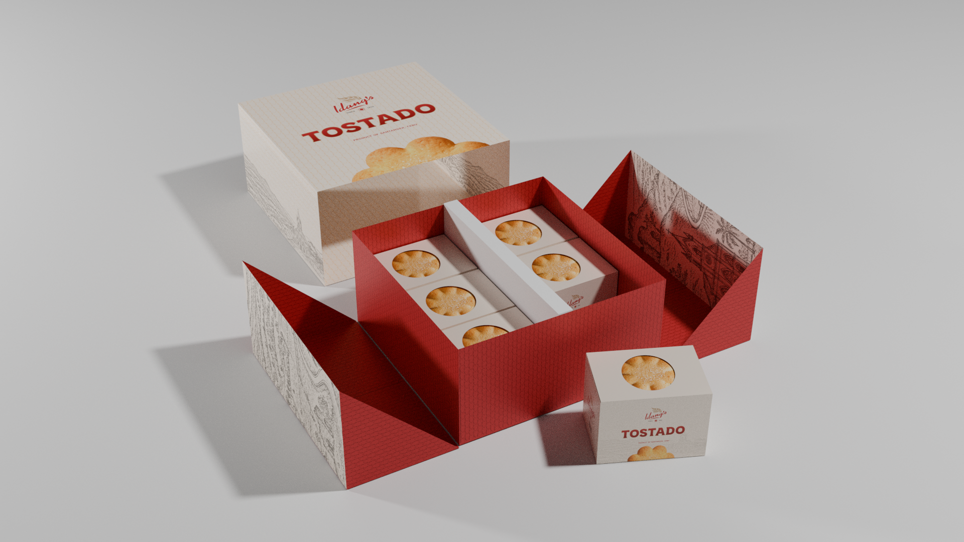
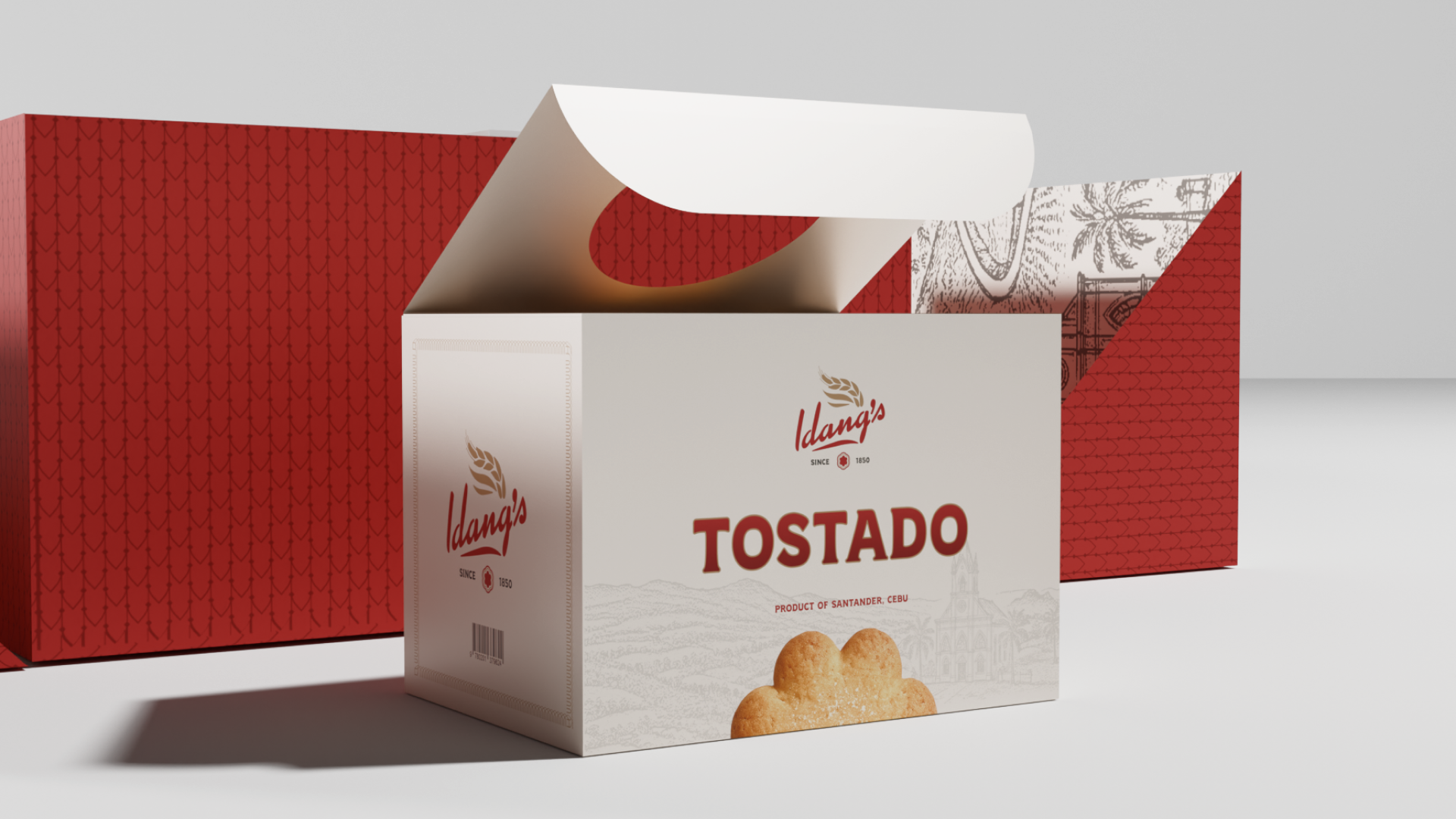
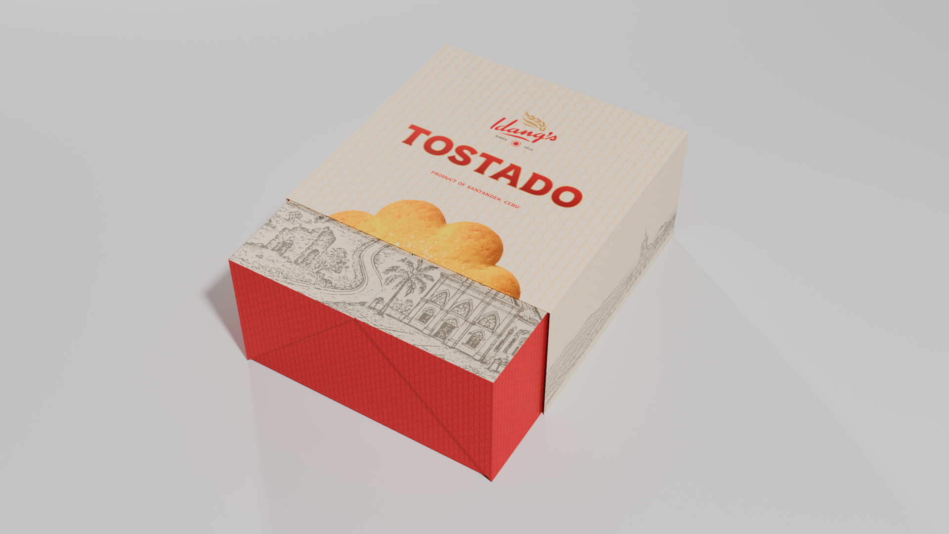
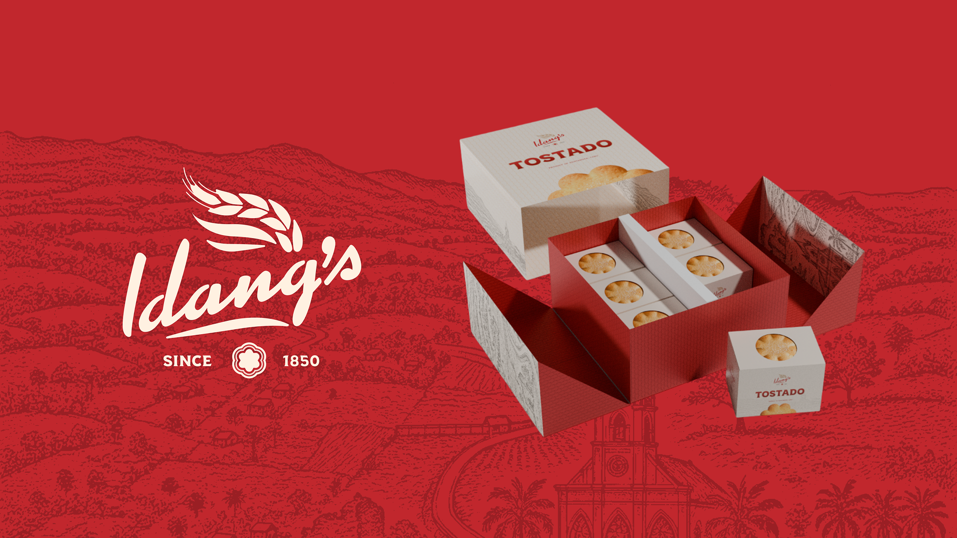
The new packaging structure was designed to improve durability and presentation, making it easier to transport, display, and gift as a high-end Cebuano souvenir.
The Final Output
The final design transforms Idang’s Tostado into a brand that feels both authentic and contemporary. It celebrates Cebuano heritage through modern design, improves shelf presence, and protects the product more effectively.
Packaging Mockup Showcase
Preserving heritage through modern packaging design.
A short takeaway about reintroducing local delicacies to a modern audience without losing their soul.
 LinkedIn