Overview
Krispy Kombi is a dynamic rebrand from its original concept, Campus Crunch. Our goal was to create a fun, bold, and highly recognizable brand identity that would stand out in the crowded snack market.
The project came with its own set of challenges, primarily stemming from remote collaboration and a lack of initial direction. This required a structured discovery process to align our vision and establish a clear, cohesive brand foundation.
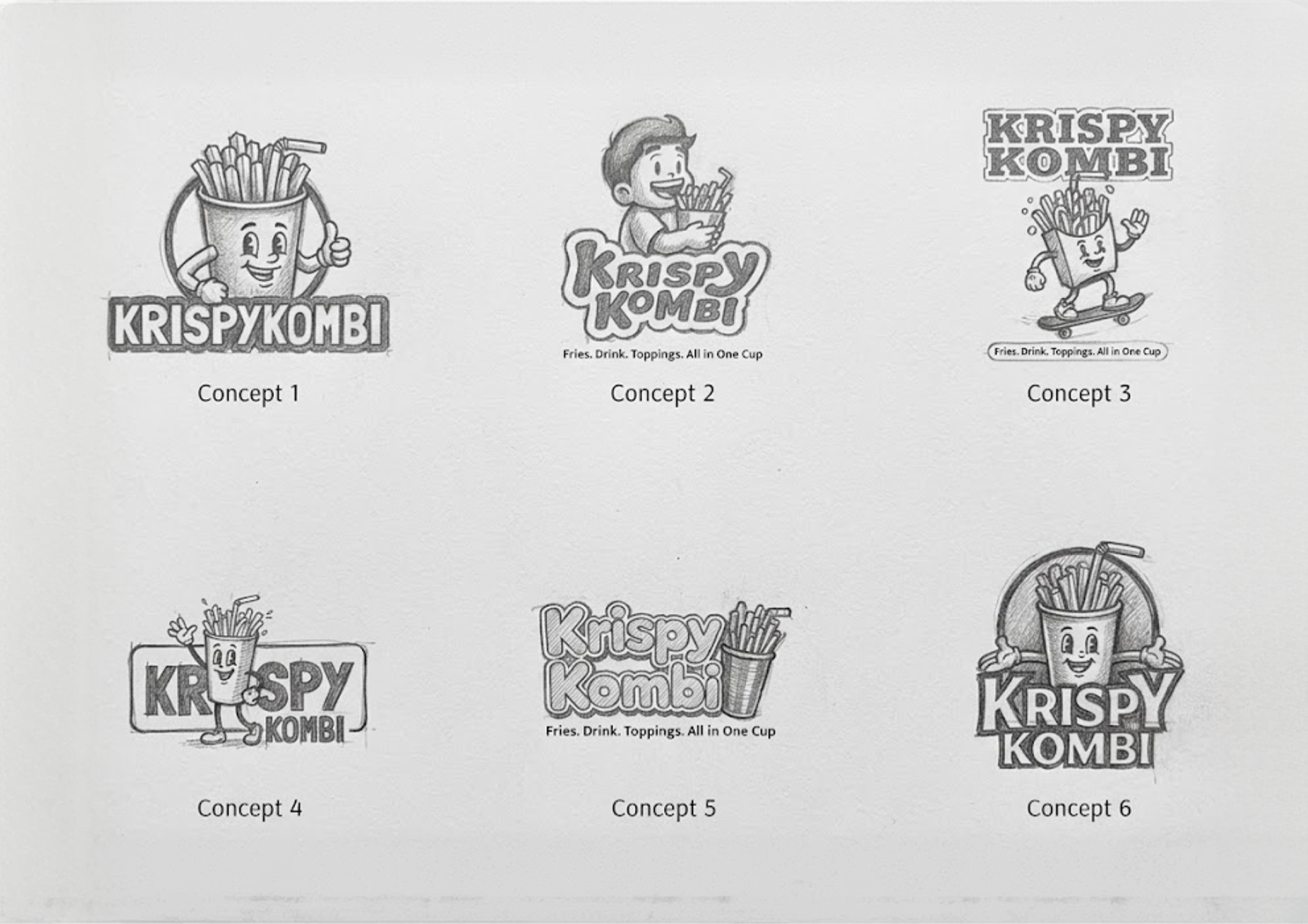
Process: Logo Exploration
The logo design process was highly iterative, involving trial and error to strike the right balance of playfulness and impact. After 7 distinct iterations, we arrived at a mark that felt both approachable and distinct.
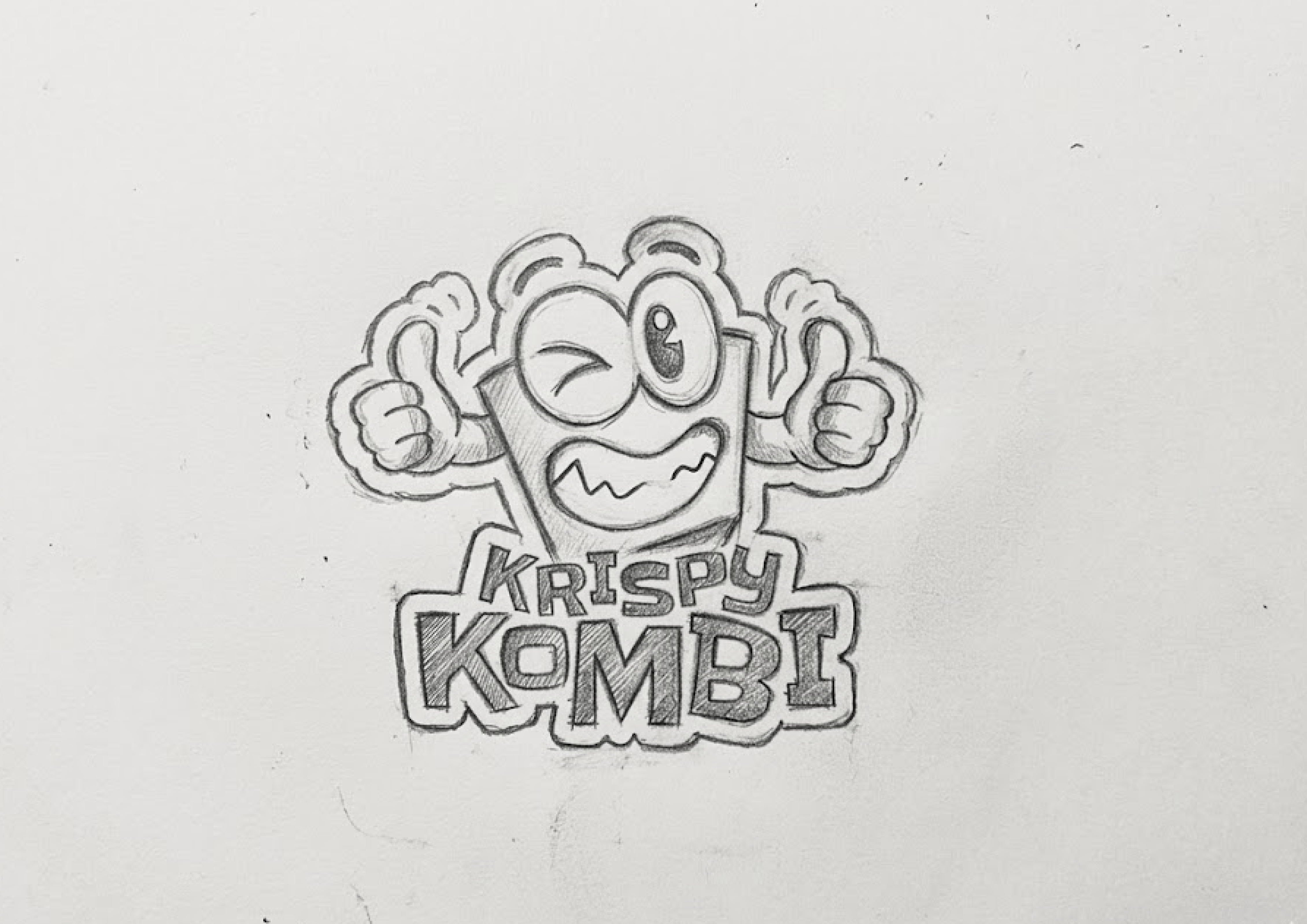
Process: Brand Direction
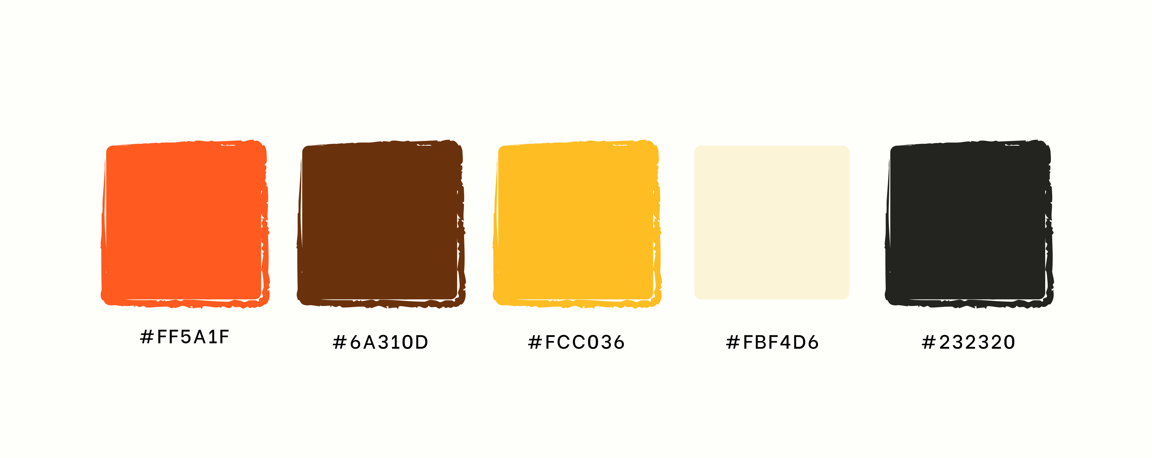
With the core logo established, we expanded the brand direction by introducing a charismatic mascot, establishing a clear typographical hierarchy, and defining a vibrant orange color system that screams energy and appetizing crunch.
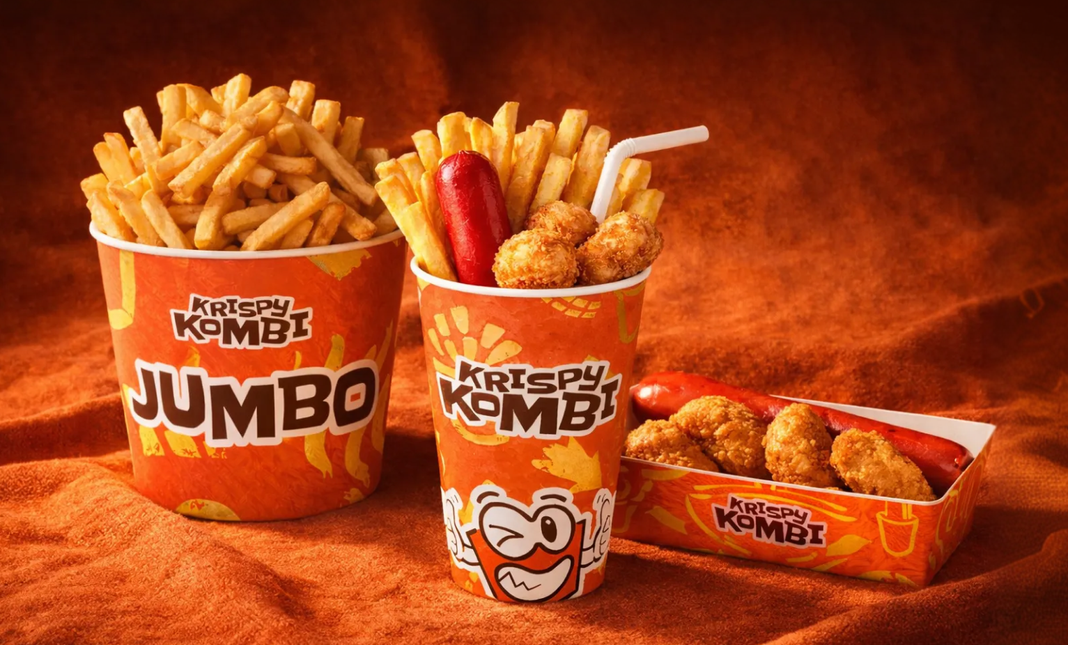
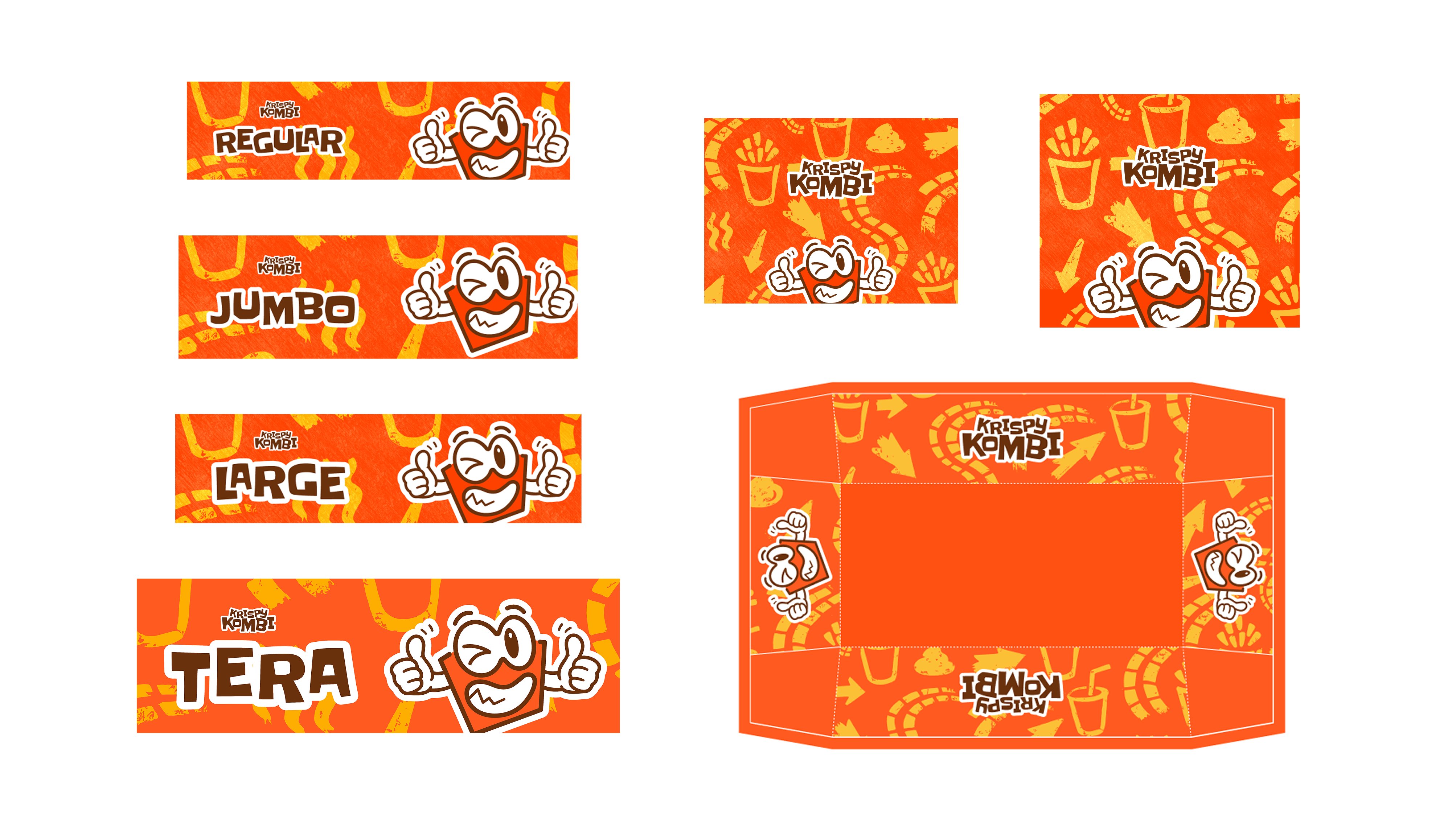
Process: Packaging Design
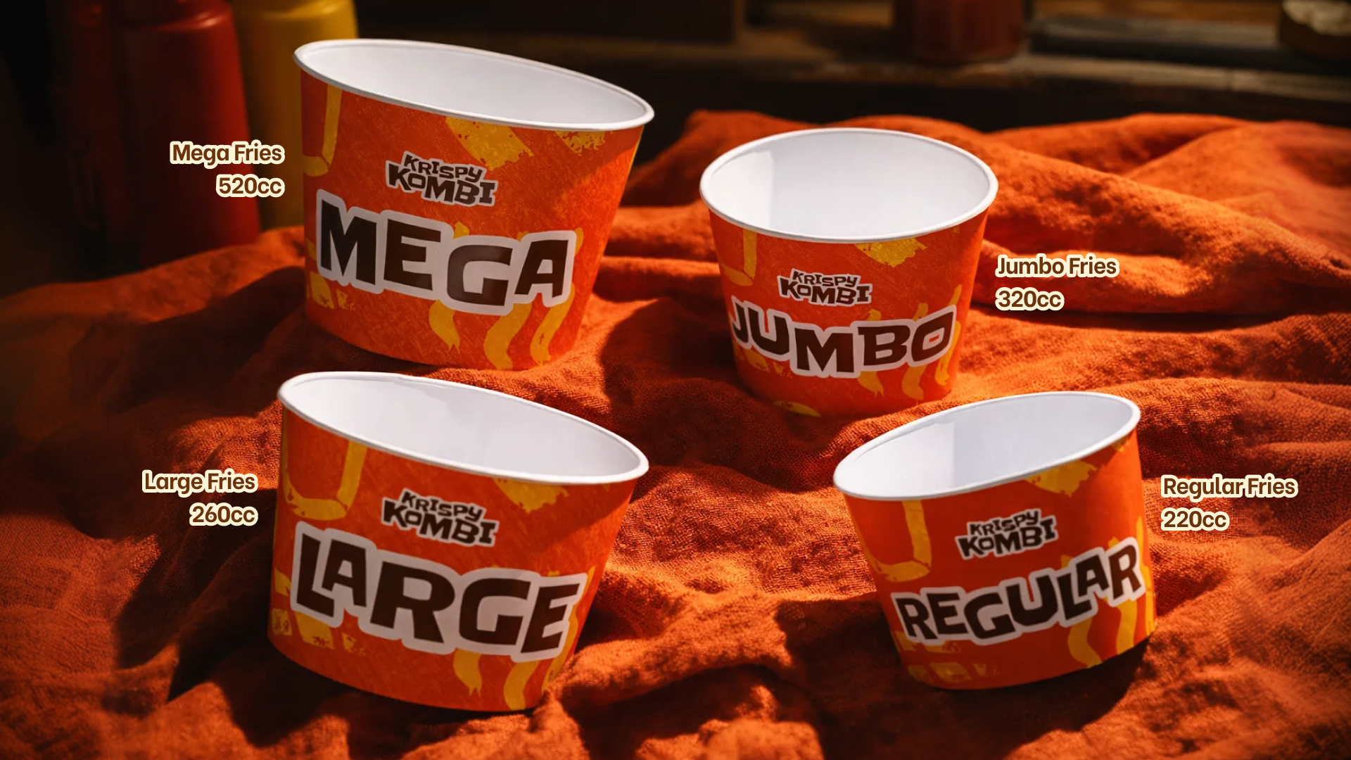
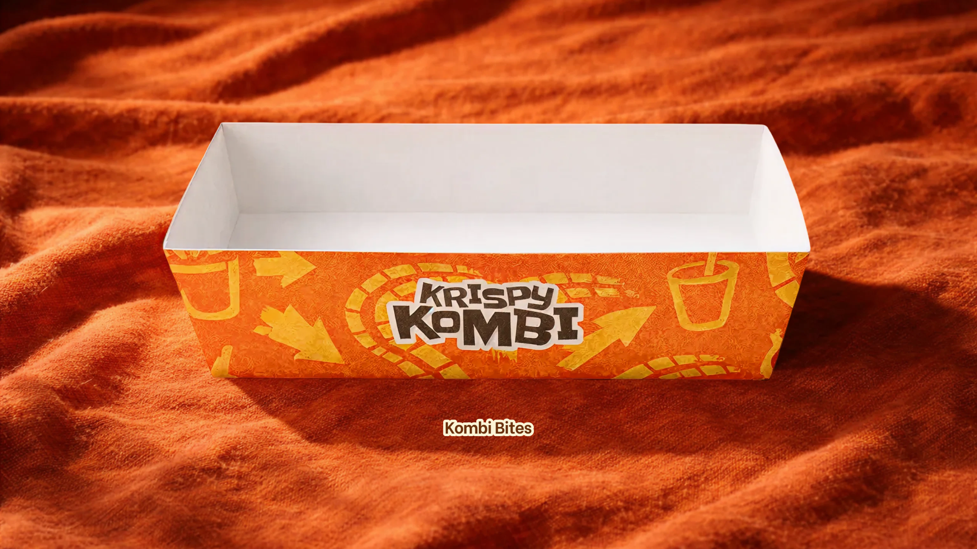
The packaging system was designed to accommodate various product sizes while maintaining brand consistency. We developed layouts for Regular, Large, Jumbo, and Mega cups, along with a custom combo tray.
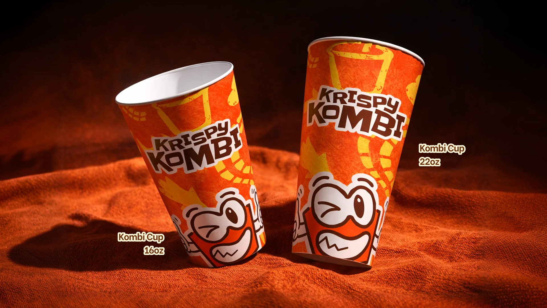
Process: Mockups
To ensure our designs translated perfectly in the real world before heading to production, we created realistic, high-fidelity mockups using Blender.
Deliverables
The final handover included a comprehensive suite of brand assets:
- Logo Variations: Primary logo, standalone mascot, and wordmark.
- Brand Guidelines: Complete color palette and typography system.
- Packaging System: Print-ready files for all cup sizes and the combo tray.
- 3D Mockups: 7 high-resolution renders including hero shots, product shots, and lifestyle contexts.
- Social Media Assets: Teaser templates, announcement graphics, and watermarks.
The Outcome
The result was a final, cohesive brand system and production-ready packaging that perfectly captured the essence of Krispy Kombi.
Beyond the deliverables, this project provided valuable key learnings about the importance of rapid iteration, establishing effective remote workflows, and the necessity of a structured design process when navigating ambiguity.
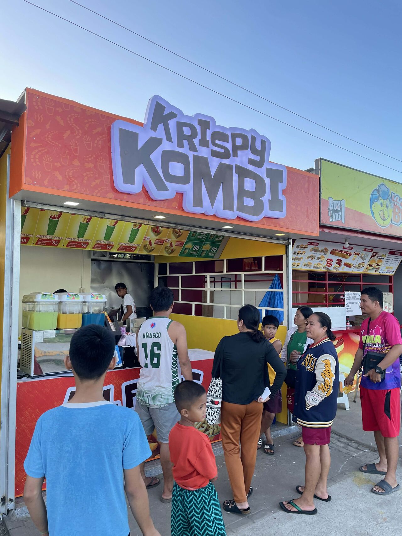
Live Store Locations
The Krispy Kombi brand is now alive in the real world! They have successfully launched and are operating 2 branches so far in Camotes, Cebu.
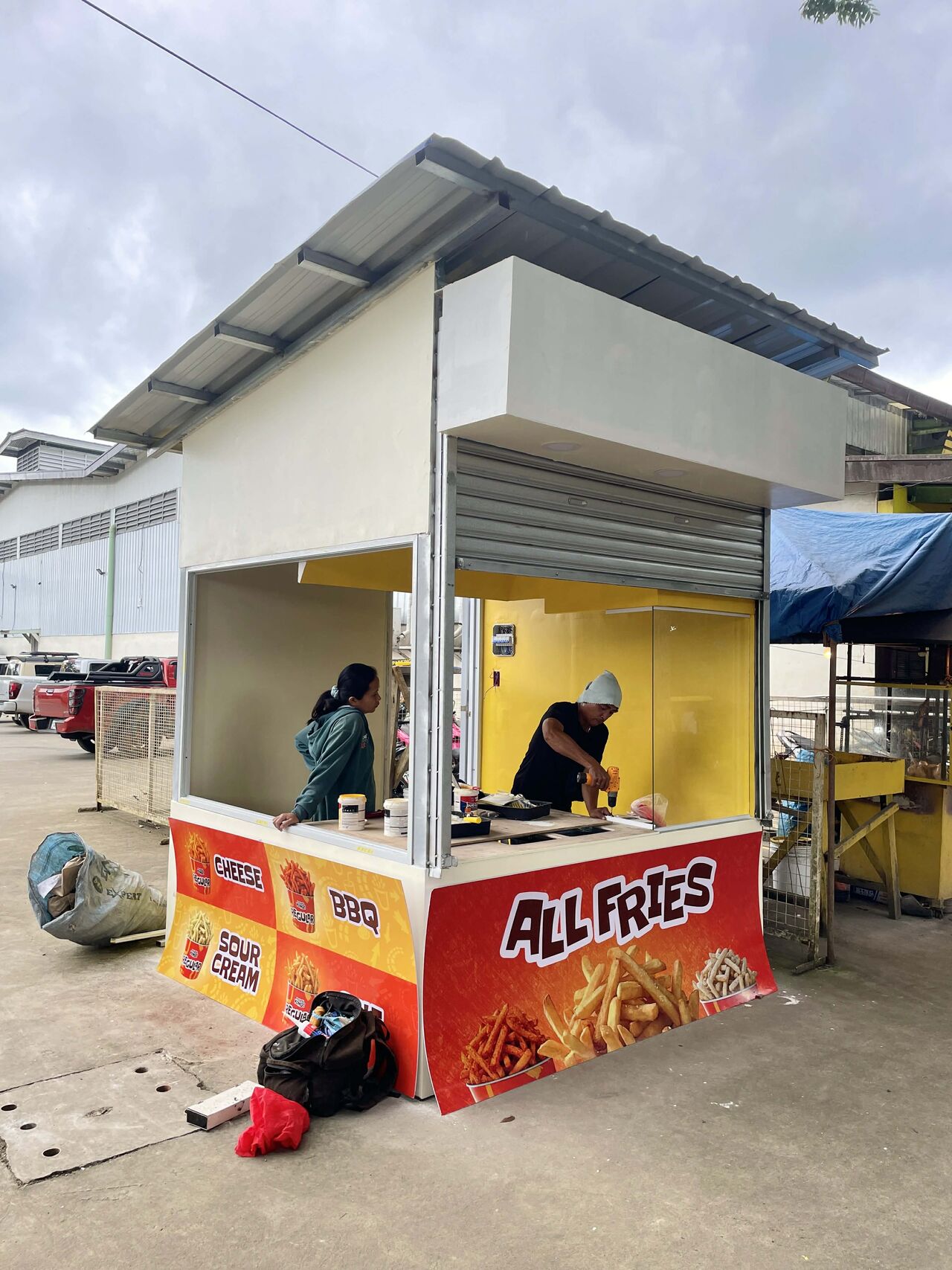
The Krispy Kombi branch store is currently an ongoing rollout. More updates to come!