
Lesson Planner PH helps teachers build structured lesson plans faster. I was brought in to design the landing experience from scratch — no existing design, no reference to build from.
The goal: make the product immediately understandable to teachers, and credible enough to support institutional B2B conversations.
Too much time on admin
Teachers spend too much time formatting lesson plans — time that should go toward teaching. No existing tool solved this cleanly for the Philippine curriculum.
The landing page had to speak to two very different audiences at once:
- Teachers — who need to feel the tool saves them real time
- Institutions — who need to trust it before they can recommend or adopt it
Structure before screens
I started with structure, not visuals. The page needed to earn trust in a specific sequence — problem → solution → proof → contact.
Lo-fi and mid-fidelity wireframes validated the content hierarchy before any visual direction was decided.
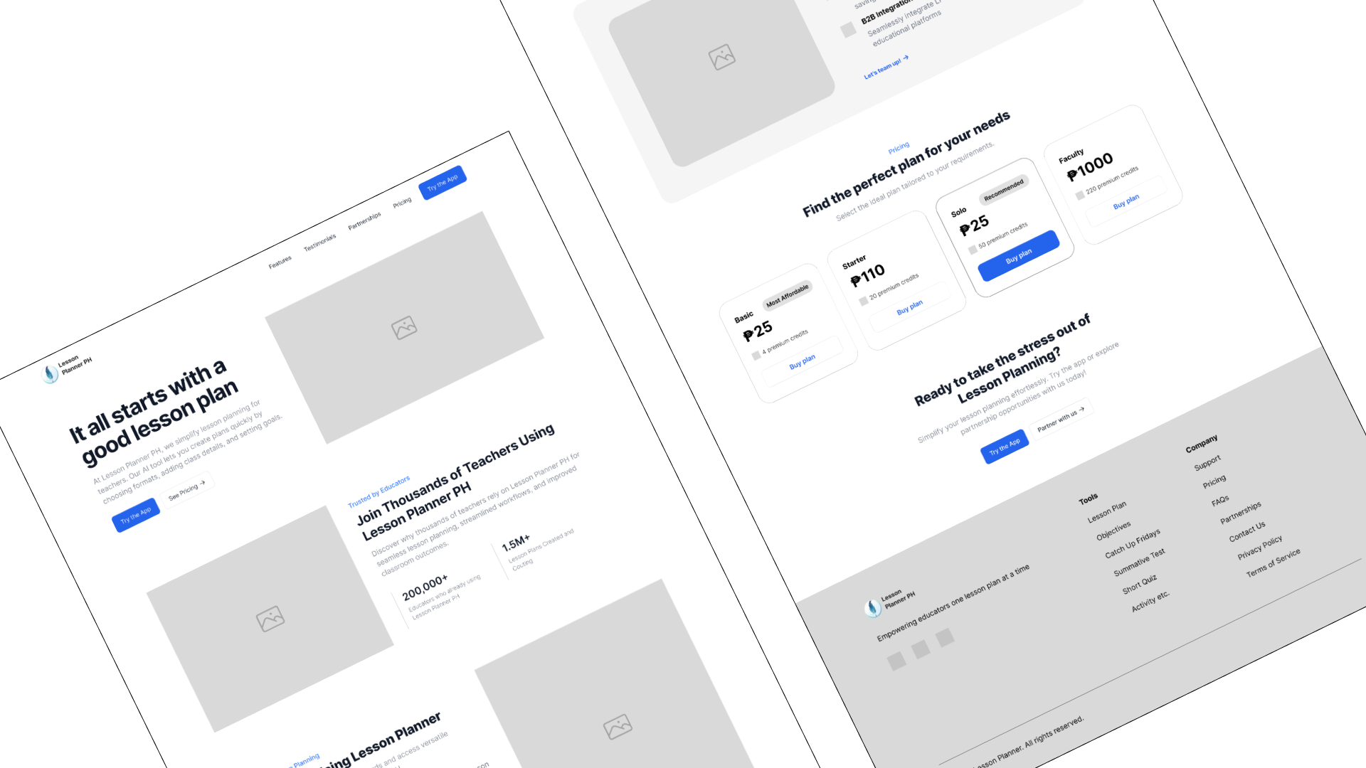
Teacher-first, institution-ready
The high-fidelity design led with a clear outcome statement, then built the case section by section — use cases, feature value, and a B2B entry point.
.png)
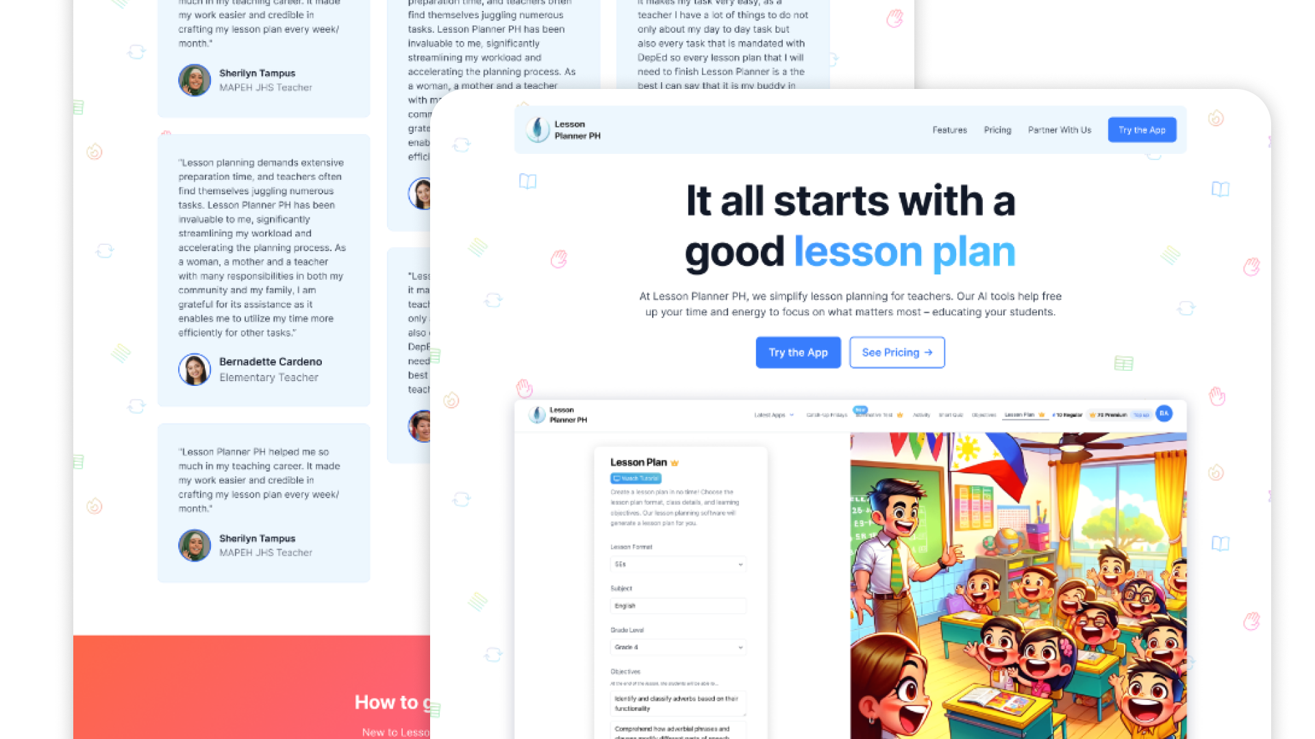
A credible first impression
The design gave the product its first credible presence — and became the foundation for early B2B and institutional conversations.
Framing outcomes over features made the page work for both audiences without compromising either.
What I learned
💡 Design the narrative before the visuals. Structure and hierarchy carry the most weight at the start.
🎯 Landing pages serve multiple audiences. In EdTech, individual appeal and institutional credibility have to coexist.